

The Kernel Loaf
-
Posts
2,072 -
Joined
-
Last visited
-
Days Won
11
Content Type
Profiles
Forums
Events
Posts posted by The Kernel Loaf
-
-
can spend hours watching this......
Why don't you post Rick Roll and Chocolate Rain while you're at it?
-
Dave from Ablach said it wasn't in the thread:
Some clarification would be helpful though.
-
I thought half of the plot intended for Ghostbusters III ended up being in the video game that came out last year?
Maybe the success of that has pushed forward the idea of a third film. I know the original intention was to make it CGI because the budget was apparently going to be over $300 million for a live-action with what Aykroyd and Ramis had wanted to do (a portal to hell opens up in Central Park and the Ghostbusters travel to a different dimension). That idea ended up in the video game. Definitely worth picking up if you are a Ghostbusters fan by the way.
-
2009 in a nutshell:
-
Lol, Reatard.
-
 1
1
-
-
Or if you're me you had to do it because your 5th year was balls, WE'RE NOT ALL SWOTS YOU KNOW!!
Nope, we were just smarter.
-
6th year was a complete waste of time, except skiving to play Street Fighter.
Highers and Advanced Highers end up meaning fuck all once you graduate or leave school to gain some relevant work experience.
-
I now own all this stuff. I'm pretty good for games now but I'm still looking specifically for:
Quackshot
Castle Of Illusion
World Of Illusion
Road Rash 2
Teenage Mutant Ninja Turtles Crystal Chaos
Any interest in Shining Force? Those two and Gunstar Heroes are the epitome of the Mega Drive for me.
-
the whole idea is to keep it plain, but fair enough.
And as far as you are saying you could knock it up in visual editor is doubtful as it uses jQuery and CMS as a back up so I can update the info like a blog [hence the php]
It would still be easy enough to update the .html on the server with a few new <img> tags instead of using a CMS for that. It just sounds like you are overcomplicating the setup of your site for the sake of it.
But, to reply to some of the points:
"the work should sell itself" - Exactly, hence the plain website, what is the point in a highly complicated website that distracts from the images and photos themselves? I'm no webdesigner and I'm not trying to act like one, the portfolio, plain and simply, is an easier way of someone to fire up my website to see the print based and logo work and photography that I do, it'd rather the content speak for itself than the design around it, I think you'll find the best portfolio's out there are the simplest ones.
Here's an alternative example of how to have a simplistic website while not being a web designer AND having a design that reflects on the quality of the content featured:
Portfolio for David Officer Photography David Officer Photography
Bear in mind that Dave's website isn't perfect, but it's more enjoyable for me to browse the content on this website than yours.
dead space: the dead space is like that so when you view it at 1024x768 [the most common setting] the images sit neat and tidy on the page and you dont have to endlessly scroll right to see things
Maybe 1024 x 768 was the "most common setting" 2 years ago, but not now. I don't find the dead space to be a problem with your layout that much, but that fact sounds like a load of rubbish.
third person: simply enough, I like the way it is written, and I've had feedback from clients, designers and people I know who own companies who think it is fine, so I don't personally see a problem with it.
So you value feedback from people you know compared to strangers? At least strangers won't butter up their feedback and provide you with an honest opinion. I worked as a web developer for a year if that makes my feedback more viable.
I've never been good at designing things for myself
Don't you study Graphic Design? Oh dear.
At the end of the day, you made a website to showcase your design work, published it, and it isn't that good. You should be developing something that will reflect your capabilities.
-
if its just to play DVDs then VLC should do the trick.
What this man said.
VLC media player - Open Source Multimedia Framework and Player
-
1
-
-
Initially it looks incredibly shit, but then it gets even worse when that stupid tune at 0:57 kicks in, the same one that all the neds use when uploading their boxing KO compilations onto YouTube. This is going to be a huge flop.
-
I wasn't talking to you.
Yes you were, child.
-
1
-
-
They're named after it.
Yeah I know. -.-
-
Was it ever released over here? I don't care about nightclubs, so let's talk about this.
Indeed it was. There was also a sequel released here on the Dreamcast called Project Justice.
There was another sequel prior to that on the PSX but it was Japan only.
-
Out of interest, why is your biography written in the 3rd person? I could understand why a company would do this, but not an individual. It gives the biography a pretentious tone. You could perhaps argue that the biography is referring to aekido, not yourself, but that's just a username.
I'm not trying to be a prick, just trying to provide some constructive criticism, and that was the impression I personally got when I read that page.
I appreciate what you were going for with the simplistic layout, but it requires some more flare. You would want your website to reflect your work with a format that is professional and would encourage visitors to acquire your services. Right now, it looks like it could probably be done in a few hours with a text editor.
One more thing - if possible, you should add some more padding in your paragraphs so the text does not touch the paragraph 'border' (I know the style sheet is just changing the background colour of the text). You should also justify the text so it suits the 'block' feel better.
-

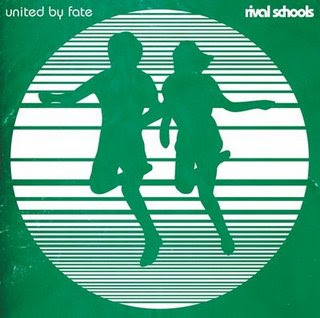
Rival Schools: United by Fate? Yas.
I always thought this was too much of a coincidence:
-
There's a feud?
-
Did anyone have a chance to see this short documentary on video games before it was taken off of BBC iPlayer? Quite an interesting watch:
YouTube - Charlie Brooker's Gameswipe - part 1/6 (BBCFOUR)
And of course, anything involving Charlie Brooker is a good thing. It's quite similar in format to his Screenwipe/Newswipe series.
-
'Proper' video game plot: Okay, so there's this nazi wizard and he has a dragon, yeah? But it's okay, because it's the year 20XX and you have a magic sword that can talk and also you have robot legs.
That reminds me of this:
and this:
-
The bet between Qui Gon Jinn and Watto is fucking hilarious.
-
im pretty sure that even if i spent an entire afternoon in my pants, alternating between wanking and eating biscuits i still would have had a more productive day than those fucktards.
How does one wank a biscuit? Unless you are playing soggy biscuit - by yourself.
-
YouTube - Top 50 worst videogame voice acting
Some crackers on there.
Jeezus christ. There's no dressing that up. The toothpaste is brown like the scary man's skin' date=' that's it. Odd lot those asians.[/quote']I think the message is either 'not everything that's black is bad', or 'don't buy a bed resembling a toothbrush'.
-
Haha, it wasn't the fantasy element, I just thought it was quite boring. It was OK don't get me wrong, but I have a slightly crazed Hungarian friend who has subjected me (I too am not an anime buff) to some extreme anime which I found ridiculously entertaining and quite mental. Spirited Away was just a wee bit tame by comparison and made me feel like I was watching Men in Black when I could have been watching 2001: A Space Odyssey.
I'm maybe being harsh, I'll rewatch it sometime soon, but I didn't take much from it on first viewing anyway.
I agree with most of this. I personally think Princess Mononoke is by far the best anime film Studio Ghibli have produced.
-

Woman breast-feeds dog
in General Discussion
Posted
A bit of a tangent, but I stumbled upon this comedy gold:
Photo Psychic | Pick Me Up magazine